Where are you placing the error messages on your form? If they’re not placed where users expect to see them, you could jeopardize their capability to complete your form.
When users make mistakes, they need to understand what those mistakes are so they can correct them and re-submit the form. They want to complete your form, but if doing so takes too much effort they’ll change their minds.
The two most common placements for error messages are at the top of the form and inline with erroneous fields. Which placement is more intuitive for users?
A research study discovered that displaying all error messages at the top of the form puts a high cognitive load on user memory. This forces users to recall each error message for each erroneous field.
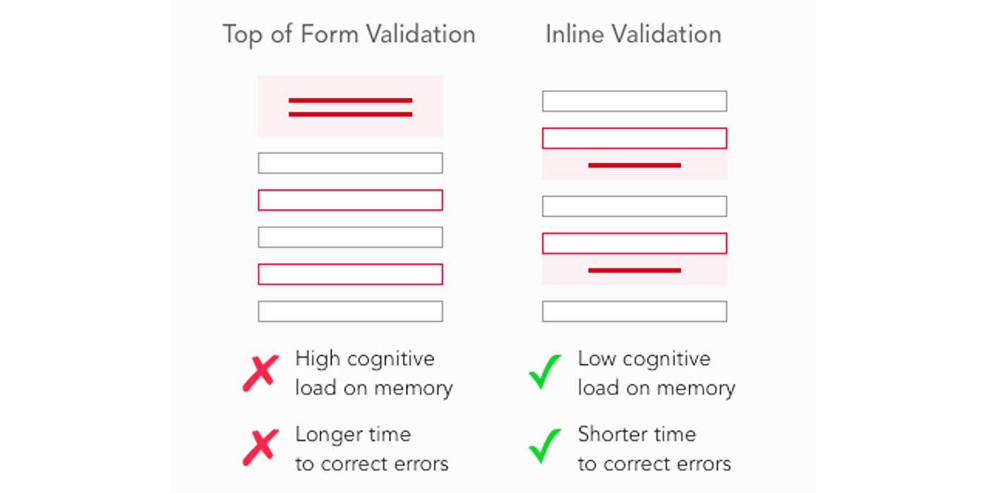
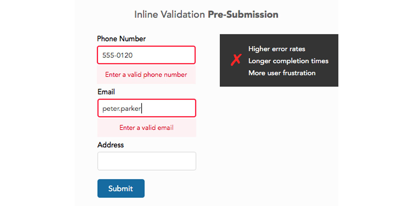
The approach that reduced the user’s cognitive load was displaying error messages inline with erroneous fields. Inline validation relies on recognition instead of recall so users can correct their mistakes faster and easier.
Another study found “the distance between the erroneous field and error message influences the efficiency of error correction”. Top of form and bottom of form validation resulted in the longest amount of time to initiate correction, while inline validation resulted in the shortest.
Top of form and bottom of form validation also resulted in the highest error rates, longest completion times, and the least user satisfaction. Bottom of form validation had the lowest error correction success rate compared to top of form and all inline validation locations.
User Preference of Error Message Locations
The study proved placing error messages inline with the erroneous fields lead to the best performance. It also showed which location next to the field was the most intuitive.
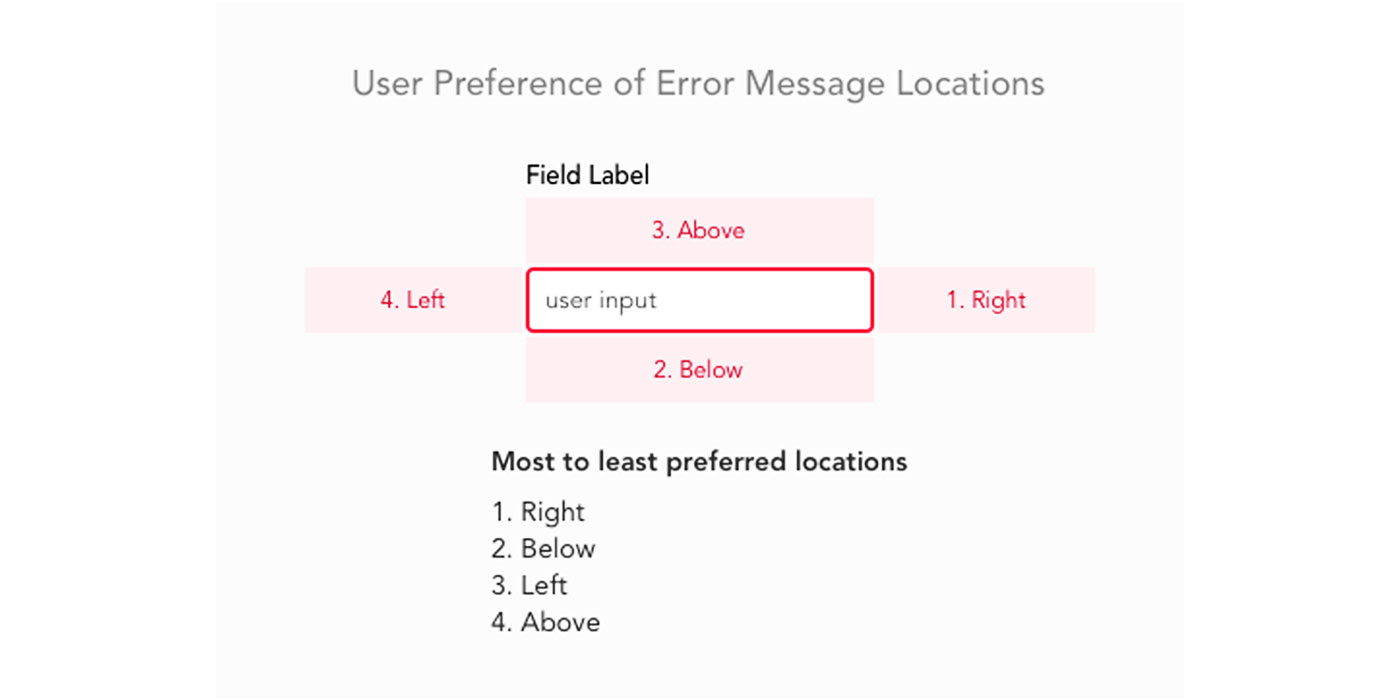
Users rated which error message location they found most satisfying. There was a strong user preference and expectation for right of the field placement.
Error messages placed to the left of the field were rated the worst. Error messages placed above the field caused the highest cognitive load followed by error messages below the field.
Why Right of the Field Is Best
It’s important to understand why placing error messages to the right of field is preferred and expected. This way designers can better educate others about how users behave when making design decisions.
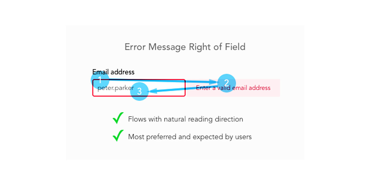
The western reading system goes from left to right. When users move their eyes from the input to the error message, it feels like a natural progression that requires little mental and visual effort. Moving their eyes from the error message back to input for correction also follows the natural flow for rereading text.
Why Left of the Field Is Worst
Placing error messages to the left of the field goes against the western reading system. Users move their eyes in the opposite direction of their natural reading flow when the error message appears. Instead of a natural progression, it feels unnatural and is suboptimal when users want to complete the form.
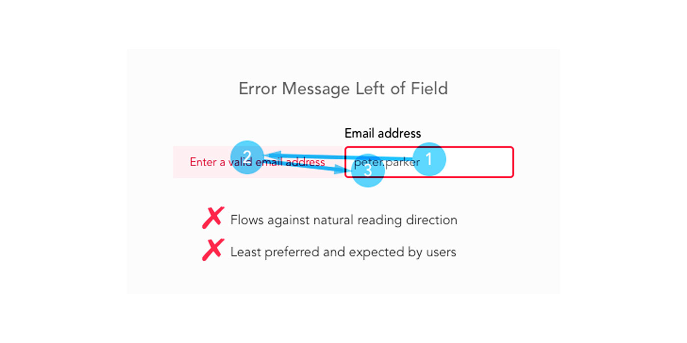
It also feels counter-intuitive because users expect higher priority elements to be on the left side. Placing the error message on the left makes it more important than the field. But the field is more important because users need to focus on it to correct their input.
Why Above the Field Increases Cognitive Load
Users experience a higher cognitive load with error messages above the field (i.e. forms with top aligned labels). This is caused by a combination of the error message and field label text that confuses users.
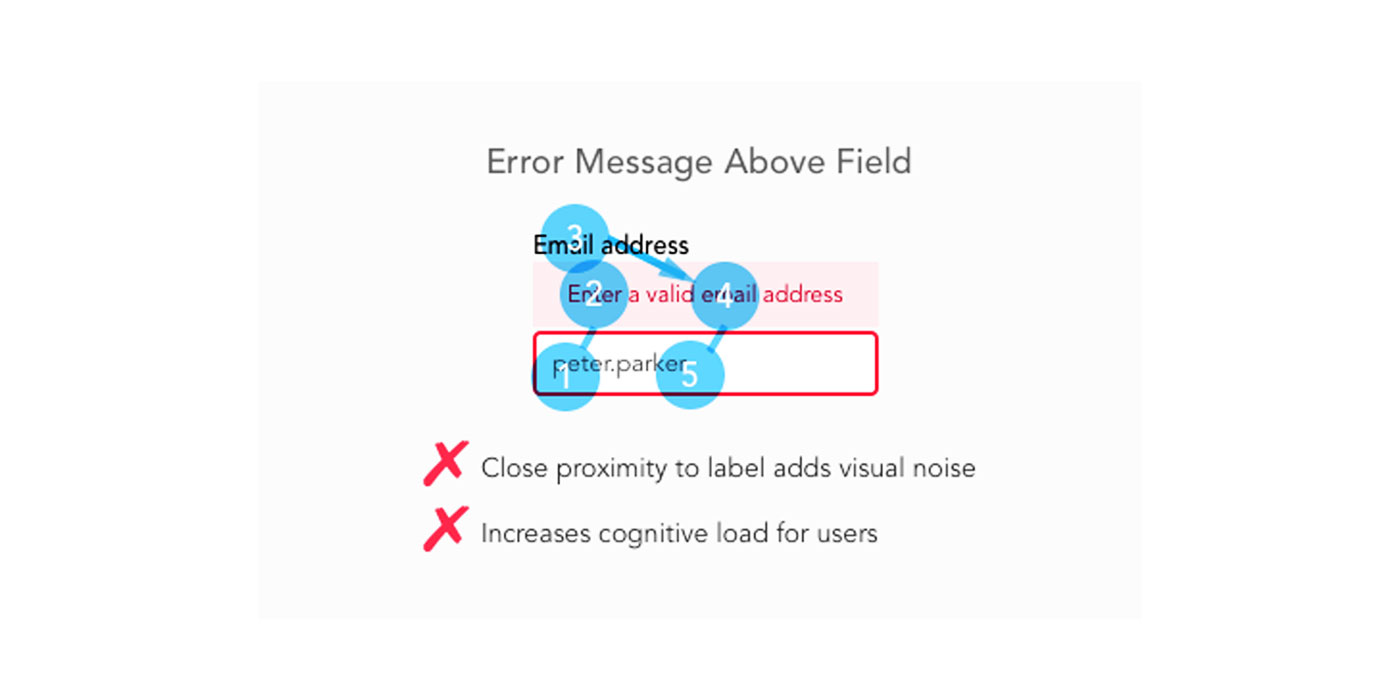
The close proximity of the two texts creates visual noise that distracts users when they’re trying to read the error message or the label. Seeing both texts in their field of vision makes it difficult to concentrate on just one of them and can confuse them.
Best Error Message Location for Mobile Forms
Mobile screens lack the horizontal space to display an error message and field side by side. This means error messages to the right of the field is not the best location on mobile forms.
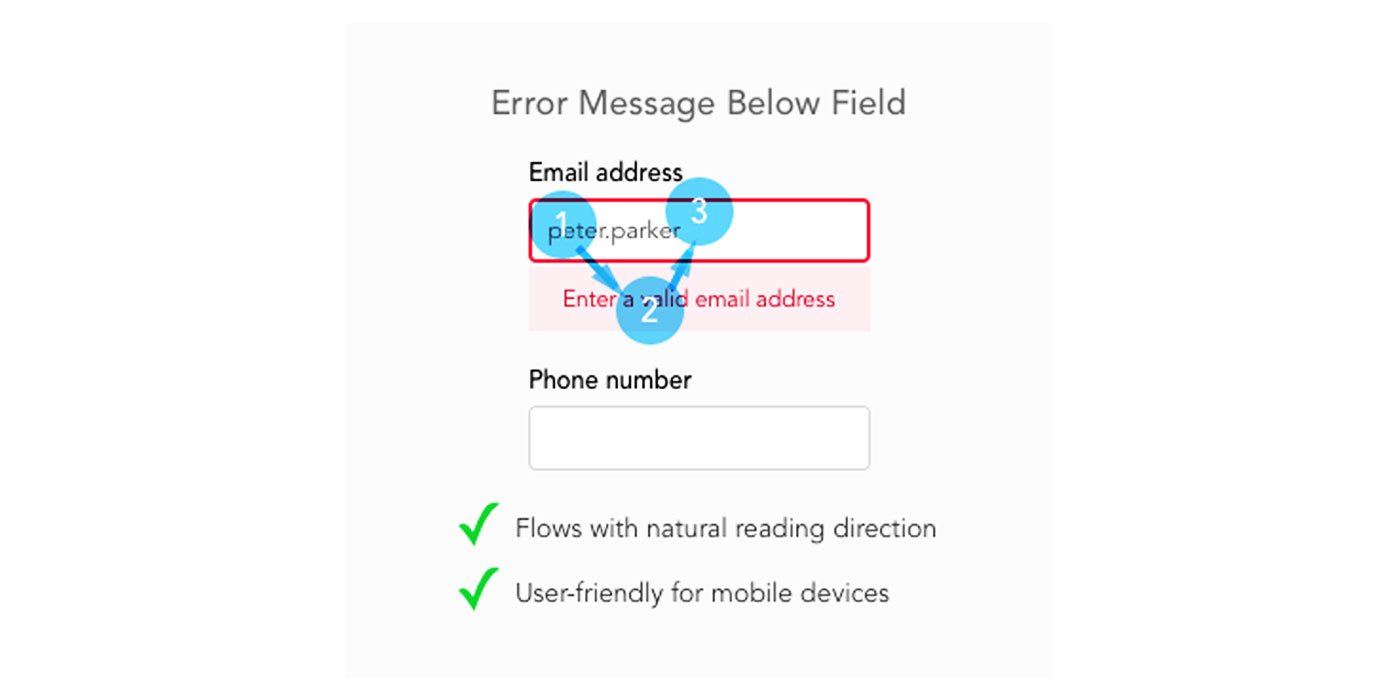
Instead, place your error messages below the field. This was users second most preferred location in the study. Although it doesn’t correspond with the user’s natural left to right reading flow, it does correspond with their natural top to bottom reading flow.
When users read text, they move their eyes left to right going down a page. Error messages below the field feel less awkward than above the field because it follows their vertical reading progression.
Placing the error message too close to the field label below it can increase cognitive load when users read the text. You can prevent this by separating them with enough spacing.
Right of Field Vs. Below Field: Which Is Best?
Both to the right of the field and below the field are optimal locations for error messages. But which placement should you use? This depends on how much work you’re able to do.
If you want the placement that takes less time to implement for desktop and mobile devices, opt for error messages below the field. Implementing them for desktops will make them usable for mobile devices as well.
If you have time to implement error messages for both devices, opt for placing them to the right of the field on desktop and below the field for mobile devices. Not only will error messages to the right aid user scanning better, but it also results in a shorter form length.
Intuitive Error Message Placement
Follow these practices and place your error messages where users expect to see them. Error messages should correspond with user reading flow, so errors take less cognitive effort to correct.
When users work and think less, they’re able to complete your form faster. No one enjoys filling out forms. The faster you help users get through it, the sooner they can move on to what they really want to do.